Logo

Since 2007, the review of promotional material has led to the use of a logo that is different but in keeping with the organization's graphic look over the years. This change enables us to have a more contemporary and eye-catching signature that is more consistent with the development of our corporate image.

In 1997, the organization took advantage of the production of new promotional materials (brochures, folders, posters, business cards, envelopes) to adopt this graphic as the organization's logo. It is in a dark green colour that contrasts with the white colour of the paper.

1997-2007
This logo first appeared on the organization's brochures and folders developed in 1992. These promotional tools, designed for various community organizations, let stakeholders know about our mission, services and major accomplishments. The two white triangles on an apple green background were used on the cover pages to avoid having to use photos illustrating men with relationship problems. This abstract graphic allowed us to avoid stereotypes, create interest and intrigue the reader. It was incorporated gradually between 1994 and 1997 into various documents as a graphic expression of the concept and as a complement to the official logo that took up less space.

1986-1997
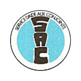
The organization used its first logo from 1986 to 1997. It showed two faces within a medallion separated by the letters S.A.C. The first version was in cyan blue. In 1988, it was changed to a grey colour that was considered less garish.


